Absolute vs. Relative Valuation: A Tale of Two Questions (With Real SEC Data)
A methodology write-up, not investment advice. All figures below come from public SEC EDGAR filings (10-K/10-Q).

Part 1 — Two Ways to Ask “What Is This Company Worth”
Every valuation framework eventually collapses into one of two philosophical camps, and it’s worth being explicit about which camp you’re standing in before you trust a number.
Camp one: intrinsic (absolute) valuation. You build the company’s value from the inside out — project its future cash flows, discount them back at a rate that reflects risk, and arrive at a number that doesn’t care what the market currently thinks. This lineage traces back to John Burr Williams’ The Theory of Investment Value (1938): an asset is worth the present value of what it will pay you, full stop. DCF, dividend discount models, and residual income models all live here.
Camp two: relative valuation. You never actually value the company on its own — you value it against its peers, on the assumption that the market has priced comparable businesses roughly correctly, and any gap between your target and the group is the signal. Multiples (P/E, EV/EBITDA), and more broadly any peer-ranking or scoring system, belong here.
These aren’t “one is right, one is wrong.” They rest on different assumptions about what you can know. Absolute valuation assumes you can out-forecast the market. Relative valuation assumes the market is roughly right on average, and your job is just to spot the outlier.
Where intrinsic valuation earns its keep — and where it breaks
The appeal of DCF is that it’s the only method that derives value from the actual economic engine of the business — cash generation — rather than from what other people happen to be paying for something similar. That’s genuinely powerful in a world where whole sectors can go mad (2000, 2021).
The catch, and Aswath Damodaran has written about this extensively, is that DCF outcomes are absurdly sensitive to three inputs: growth rate, discount rate, and terminal value. Terminal value alone routinely makes up 60–80% of the entire enterprise value in a standard model — built on a single point estimate of perpetual growth. You get a number precise to the cent, built on an assumption nobody can actually verify. That’s not a flaw in the math; it’s a flaw in mistaking precision for accuracy.
There’s a second, quieter problem: a DCF can be “right” for years while the market ignores it completely. Being correct and being timed correctly are not the same skill.
Where relative valuation earns its keep — and where it breaks
Multiples don’t require you to forecast a decade out. They’re fast, they scale to hundreds of companies at once, and — crucially — they encode information a spreadsheet can’t easily capture: management quality, regulatory overhang, sector sentiment, all baked into what the market is currently willing to pay for comparable businesses.
The structural weakness is circularity. Relative valuation only works if the peer group is priced correctly on average. If an entire sector is inflated (dot-com internet stocks, 2021 SPACs), relative valuation will happily confirm your target is “cheap relative to peers” — while the whole group is expensive relative to reality. It also tends to ignore company-specific risk (leverage, earnings quality) unless that risk is explicitly built into the comparison metric.
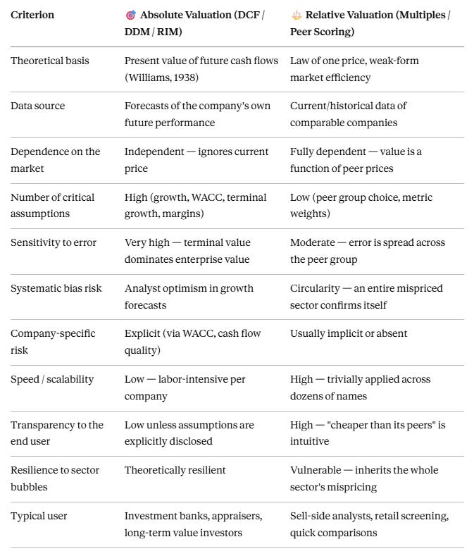
Table 1 — Head-to-head comparison
Part 2 — A Case Study in Combining Both: What a Fundamentals-Only Tool Got Right (and Where It’s Incomplete)
I run a small side project, duelstocks.com, that pits two public stocks against each other using only data pulled directly from SEC EDGAR filings — no analyst estimates, no sentiment, no price action. It produces three separate reports per matchup, and the interesting part, methodologically, is that it deliberately doesn’t try to answer both valuation questions with a single number.
2.1 The relative layer (Battle Report)
Instead of a single multiple, it scores eight orthogonal fundamental metrics — Revenue Growth, Operating Cash Margin, ROIC, Sloan Ratio, Asset Turnover, Receivables Turnover, Operating Margin, FCF Margin — weighted into a 0–100 score per side. Using eight metrics instead of one dodges the classic failure mode of relative valuation (a single multiple breaking on negative earnings, for instance).
One inclusion worth flagging: the Sloan Ratio (Sloan, 1996, The Accounting Review), a well-established accrual-based earnings-quality metric used to flag potential earnings management. Seeing it in a free-tier tool is unusual — it’s a level above the typical “just compare P/E” approach.
2.2 The absolute layer (DCF Report)
The DCF model applies three quality multipliers on top of a standard three-year projection + terminal value structure:
A Sloan Ratio penalty (–3% to –6% on year-1 growth) that punishes aggressive accrual accounting.
An ROIC multiplier (0.90×–1.10×) that scales projected growth by how efficiently the company actually converts invested capital into returns — a direct nod to the idea that growth without returns above the cost of capital doesn’t create value.
An FCF margin multiplier, same logic, applied to cash conversion quality.
This is a genuinely useful answer to the “garbage in, garbage out” problem: instead of blindly extrapolating historical growth, the model discounts low-quality growth before it ever reaches the discounted cash flow math. WACC is also derived from an ROIC tier (beta 0.85–1.35) rather than historical price volatility — an unconventional choice that avoids importing market noise into the risk estimate, though it substitutes one un-validated assumption for another (more on that below).
2.3 What’s missing, scientifically speaking
To be fair to the model rather than just flattering it:
No sensitivity analysis or confidence interval. A textbook DCF ships with a WACC × growth sensitivity table or a Monte Carlo range. This model outputs a single point estimate per year — which reintroduces exactly the “false precision” problem discussed above.
No country/macro risk premium in WACC — fine for US large caps, a real gap if the tool ever covers non-US tickers.
The “relative” layer compares one pair, not a peer group. Academically, relative valuation means comparing against a broad peer set or sector median. A head-to-head “duel” is closer to a paired comparison than a full relative-valuation exercise — great as a content format, less rigorous as methodology.
Base weights are heuristic, not backtested. Worth noting: the pro tier lets users set their own weights, so the defaults are a starting template rather than a hard-coded model — but neither the defaults nor user-set weights have been validated against historical realized returns. That’s an open question, not a flaw specific to this implementation.
No explicit upside/downside vs. current price on the output, though it’s trivially derivable from the fair value figure.
Mixed reporting periods (some metrics quarterly, others annual) — the tool discloses this itself, but it’s a real source of noise, especially for anything with seasonality.
No share dilution/buyback modeling going forward — fixed share count at T0, which can overstate long-horizon fair value per share for stock-comp-heavy tech names.
None of this makes the tool “bad” — these are the same tradeoffs professional sell-side models make constantly. It’s worth naming them explicitly rather than pretending a clean dashboard number is a substitute for the underlying uncertainty.
Part 3 — The Interesting Part: When All Three Methods Disagree (NVIDIA vs. AMD)
This is where it gets genuinely useful as an illustration of Part 1’s argument, because the three reports on the exact same SEC filing data produce three different rankings.
3.1 The relative score: total domination
The weighted duel score comes out 92–8 in NVIDIA’s favor — “Dominant.”
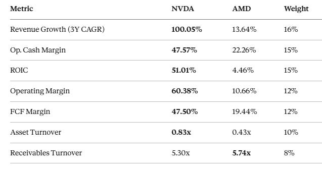
This is relative valuation doing exactly its job: aggregating a wide set of operational signals into an unambiguous read. An ROIC gap of 51% vs. 4.5% isn’t rounding error — it’s a real, order-of-magnitude difference in how efficiently each company deploys capital right now.
3.2 The absolute number: the gap narrows, and briefly reverses
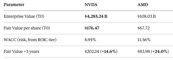
Here’s the first genuine disagreement between methods: despite the 92–8 relative blowout, the DCF-implied 3-year upside is higher for AMD (24.0%) than for NVIDIA (14.6%). The mechanism is straightforward — NVIDIA’s dominance is already priced into a ~$4.3T enterprise value, so even a growth rate capped at the model’s 35% ceiling produces a smaller percentage upside from an already-elevated base than AMD’s more modest 13.6% growth does from a much lower one. Relative valuation answers “who’s winning right now.” Absolute valuation answers “how much have you already paid for that win.” Those are different questions, and here they point in opposite directions.
3.3 The resilience twist: the “winner” scores lower on stability
This is the part that actually surprised me when I first pulled it.
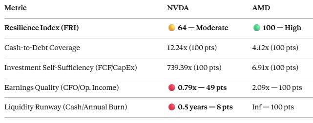
A company that just won the duel 92–8 and carries a $4.28T DCF-derived enterprise value scores only 64/100 on this resilience index — versus a perfect 100 for the company it just demolished. Two components drag it down: an earnings-quality ratio below 1.0 (operating income exceeding operating cash flow — the reverse of what’s usually considered healthy), and a liquidity-runway score that flags cash reserves as covering only half a year of “burn.”
Scientific caution is warranted here: with $102.7B in operating cash flow, nobody seriously believes NVIDIA faces a liquidity crisis. The runway metric almost certainly reflects the specific formula (cash on hand relative to some computed burn rate) rather than actual operational fragility — a good live example of the “metric designed for cash-burning unprofitable companies produces a weird result on a profitable giant with a different balance sheet structure” limitation flagged in Part 2. But the underlying point stands: the same SEC filing data produces three different conclusions depending on which question you ask it.
3.4 Cross-checking the pattern on two more pairs
To avoid building an entire argument on one flashy example, the same divergence shows up on two other matchups pulled the same day:
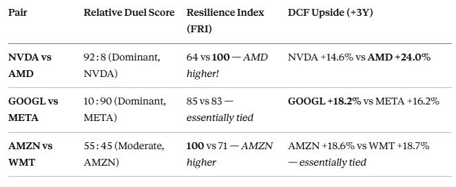
The pattern holds up: in GOOGL vs META, a 10–90 relative blowout collapses into an essentially meaningless 2-point resilience gap (85 vs 83), and the loser of the duel (GOOGL) has a slightly higher DCF-implied upside than the winner. In AMZN vs WMT, the relative score is close (55–45), but resilience diverges sharply (100 vs 71, driven by Walmart’s low investment self-sufficiency — a 0.56x FCF/CapEx ratio meaning it relies more heavily on external financing than Amazon does), while the DCF upside is nearly identical for both.
The takeaway: a lopsided relative score does not reliably predict either the resilience ranking or the absolute-return ranking. In all three pairs, at least one of the other two methods contradicts, or substantially fails to match, the relative “duel” outcome.
Conclusion: Two Questions, Not One
Circling back to Table 1: relative valuation and absolute valuation aren’t competing answers to the same question — they’re correct answers to different questions, and conflating them is where most retail (and plenty of professional) analysis goes wrong.
Relative valuation answers “which of these two businesses is operationally stronger right now” — and it does that job well. A 92–8 score reflecting a 51% vs. 4.5% ROIC gap isn’t noise; it’s a real, current, structural difference in capital efficiency.
Absolute valuation answers a different question entirely: “how much of that advantage is already priced in, and how much upside is actually left.” It can — correctly — hand the higher implied return to the operational loser, because it explicitly accounts for the fact that dominance shows up in the price, not just in the business.
A resilience/quality overlay answers a third, narrower question: “what happens if conditions deteriorate.” It’s the layer most likely to warn you that today’s clear winner isn’t automatically the safer holding — while also being the layer most vulnerable to producing counterintuitive noise from formulas that weren’t designed with every balance sheet shape in mind.
The practical conclusion isn’t “pick the better method.” It’s that none of the three should be read in isolation. A tool — or an analyst — offering only the relative score would show you total dominance and nothing else. Offering only the DCF would hide just how lopsided the underlying operating gap actually is. Offering only the resilience score risks the mistaken conclusion that the weaker operator is the safer bet, full stop. It’s the combination of all three lenses — relative, absolute, and resilience — that produces a coherent, decision-useful picture. That’s the actual methodological argument this whole piece has been building toward.
Not investment advice. All data sourced from public SEC EDGAR filings (10-K/10-Q) via duelstocks.com.